

Reader-friendly text formatting: Why it matters
The way you design your text can improve the chances that your reader will consume your whole article. If the text is even slightly difficult to read, your readership will decline.
During the pandemic, I thought my eyesight was getting worse, but an exam showed no change. What had changed was my behaviour. I’d been spending many more hours in front of the computer on client Zoom calls, and for a course I was taking. My eyes were tired, and for most of us, that hasn’t changed since the pandemic.
Here’s how to make your text easier to read and scan.
You might think, I want my whole text read, not scanned. But that’s not how we naturally consume information when we go searching for it. Normally, we’re seeking an answer to a specific problem.
Design for multiple devices
Although most of us get information on our mobiles, giving less importance to other devices may reduce readership. This is why I don’t believe in ‘mobile-first’ design.
Mobile-first design means considering small screens over other devices. This isn’t a necessary trade-off. Designers and developers can and should accommodate varied screen sizes.
I spend a lot of time on my phone for personal use and client communication. However, most business reading, such as articles and research, is done on my desktop or laptop – using my handy Notion web clipper [write article to link to] to save research notes as I read.
Use comfortable column widths
I see this readability killer every day, even by designers I admire. If you’re publishing a blog post on your website or creating a slide deck for clients, don’t force them to read wide bodies of text.
While this isn’t an issue on mobile devices, it’s terrible on desktops and laptops. Setting your column widths to a narrow enough width for quick scanning is easy on most publishing platforms.
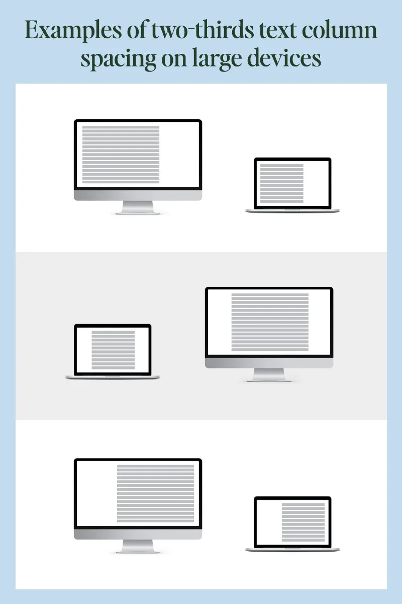
While it’s difficult to give exact dimensions for larger devices without getting too technical, a two-thirds column layout is a good maximum width to use. Meaning, only use two-thirds or less of your web page for paragraph text.
Use subheads to help with scanning
Subheads are essential for making text user-friendly. They let the eye rest between scanning and help quickly spot the information the reader needs most.
Large bodies of text with few subheads are like road trips with too few rest stops – they’re exhausting. An exception may be for storytelling. Subheads in a story would interrupt the flow of the prose unless there’s a stylistic reason for it.
Increase your font size
Larger font sizes aren’t just for an older audience. Larger fonts are easier to scan than smaller ones, making them another simple way to improve readability.
It’s difficult to give an exact size prescription because typefaces vary in weight and design; most readability guidelines recommend a minimum size of 16 points. If your paragraph text is 16 or smaller, try bumping it to 18 or 20 – test it with friends or clients.
Be sure to test font sizes on multiple devices. Many website platforms will automatically resize text for different screen sizes. If the font is difficult to read on one screen but not on another, hire a developer to adjust the font size across different media sizes with a bit of code. This isn’t complicated; it’s a quick fix.
Choose a reader-friendly font
While this topic often ventures into opinion territory, some fonts objectively improve readability more than others.
There have been endless debates about serifs or sans-serif fonts. Serifs have the extra bits at the top and bottom of the straight parts of type. [show an example]
The truth is, both serif and sans-serif fonts work for paragraph text, as long as they aren’t too fine in different parts. Newspaper websites are a good example. While sans-serif fonts are considered by many to be easier to read on screen, websites like the New York Times, a text-heavy site, use serif fonts with success.
You can make these changes today
If you want readers to continue down a page beyond the first sentence or two, use these formatting tips to make your text easier to consume. You’ll help your readers and your business.
If you’re not in DIY mode and need updates to your website or other marketing, email me. If you have a bigger project to discuss, schedule a meeting that fits your schedule [link].