

Black Bear Brewery: great beer, fun branding
West Country Brewery
Branding / Brand Development / Website Design & Build
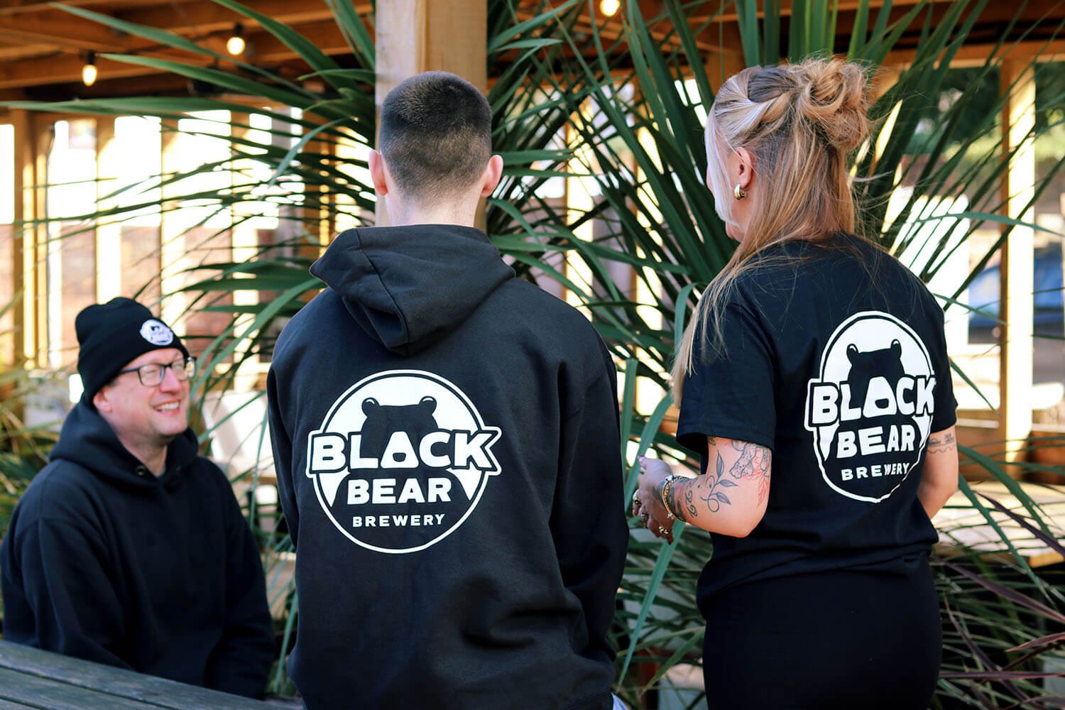
Digital is immediate, but there’s nothing like seeing work out in the real world – blown up on a wall, or walking down the street.
The challenge
Black Bear needed a brand that reflected the brew team’s style. Fun & cheeky but no-nonsense. It had to be bold enough to work well across multiple media, in both small and large formats.
It also needed to be flexible enough to bend with a developing brand while maintaining a strong, recognisable look.
Bears as symbols have been done to death – it had to bring something new to the table. And work in the green rolling hills of our beautiful Somerset, too.
The solution
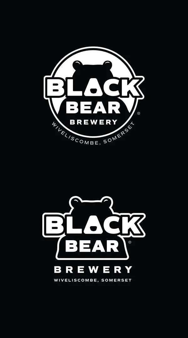
We wanted something clean and bold, and instantly recognisable. After many thumbnail sketches, I developed a distinct black-and-white logo that played off letter shapes. Drawing an icon-style bear, I turned the ‘A’ in ‘BLACK’ into a nose. The result ticked all the boxes.
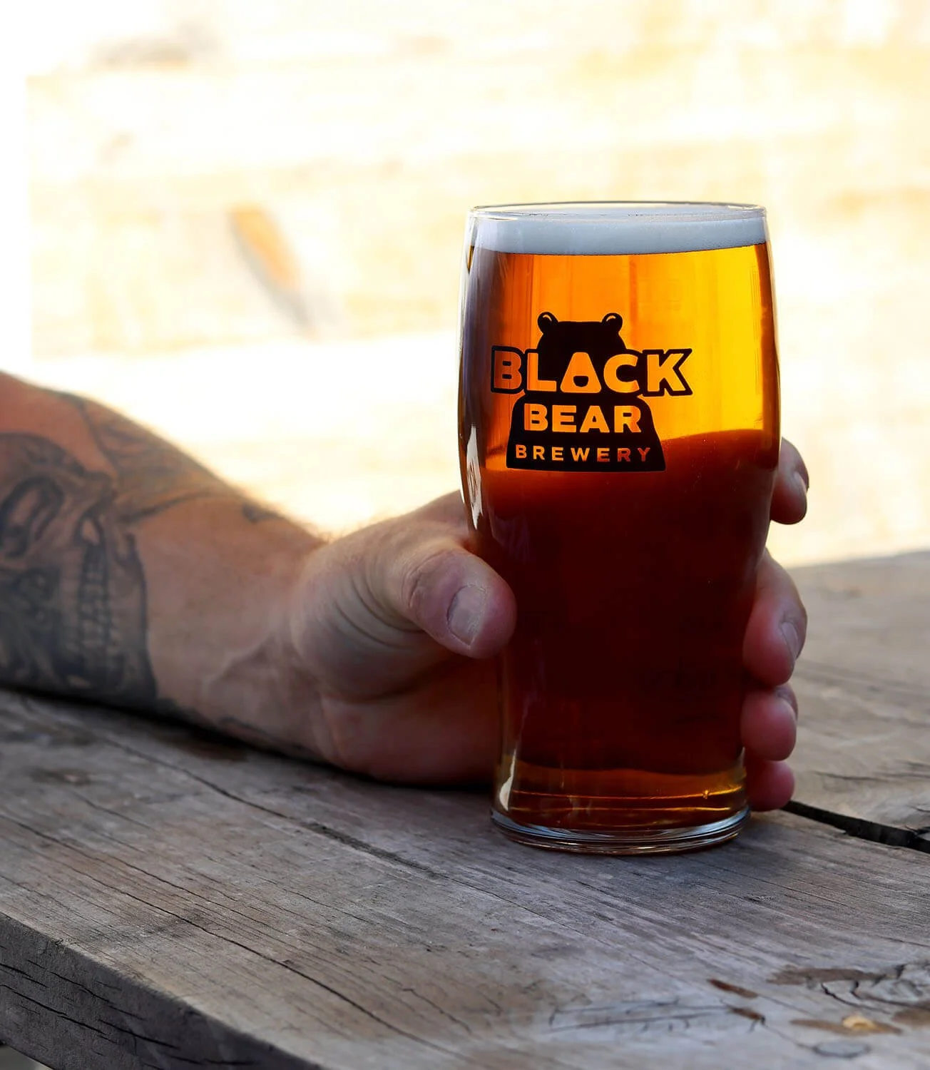
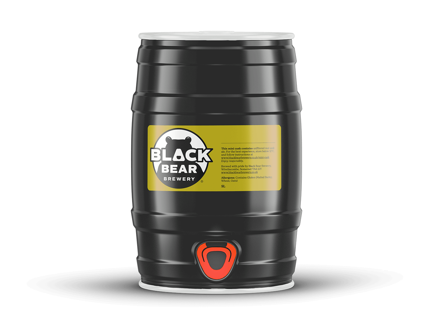
We knew pub pump clips, beer mats, and sales materials would be the main use, but merch was a big design factor, too. Fun items to give away and sell at events – think stickers for guitar cases and skate decks, hats, caps, and shirts.
This bespoke bear face is now copyrighted and splashed across digital spaces, giant banners, sales materials, and loads of merchandise. It makes just as strong an impression in tiny profile icons as it does blown up on the backs of hoodies.
Black Bear Brewery: great beer, fun branding
West Country Brewery
Branding / Brand Development / Website Design & Build
Digital is immediate, but there’s nothing like seeing work out in the real world – blown up on a wall, or walking down the street.
The challenge
Black Bear needed a brand that reflected the brew team’s style. Fun & cheeky but no-nonsense. It had to be bold enough to work well across multiple media, in both small and large formats.
It also needed to be flexible enough to bend with a developing brand while maintaining a strong, recognisable look.
Bears as symbols have been done to death – it had to bring something new to the table. And work in the green rolling hills of our beautiful Somerset, too.
The solution
We wanted something clean and bold, and instantly recognisable. After many thumbnail sketches, I developed a distinct black-and-white logo that played off letter shapes. Drawing an icon-style bear, I turned the ‘A’ in ‘BLACK’ into a nose. The result ticked all the boxes.
We knew pub pump clips, beer mats, and sales materials would be the main use, but merch was a big design factor, too. Fun items to give away and sell at events – think stickers for guitar cases and skate decks, hats, caps, and shirts.
This bespoke bear face is now copyrighted and splashed across digital spaces, giant banners, sales materials, and loads of merchandise. It makes just as strong an impression in tiny profile icons as it does blown up on the backs of hoodies.
The Result:
“When we go to beer festivals, people tell us how much they enjoy our beers, but they also mention how much they love the branding. It definitely gets attention – in the best possible way! ”
Tom Davis, Head Brewer, Black Bear Brewery
Brand Strategy
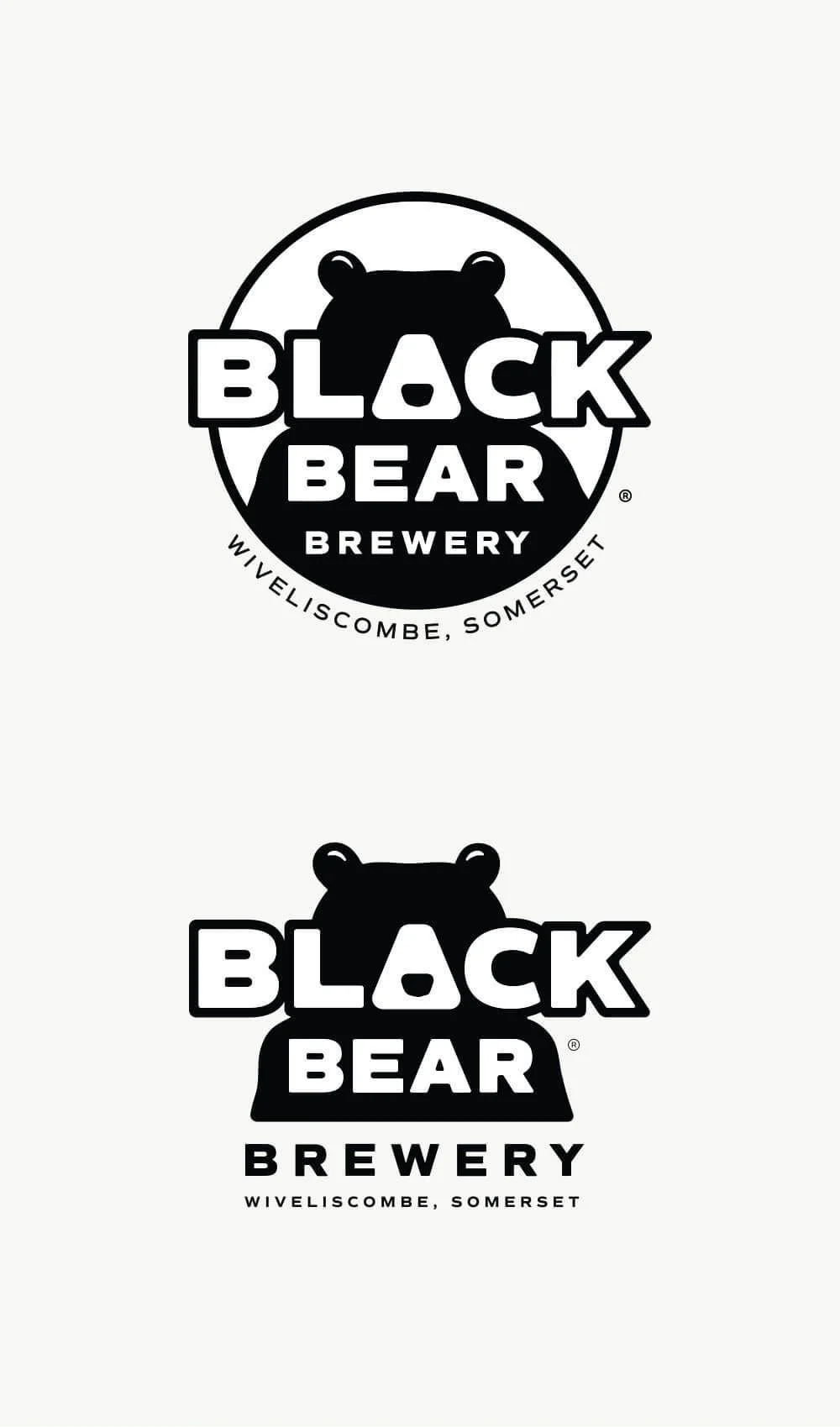
I developed the logo with variations. The distinctive bear face with an ‘A’ nose is maintained throughout.
Logo Variations
Headshot logo
This version is used for things like pocket placement on T-shirts. It also sits nicely in the website header. It’s also been used in anthropomorphic ways – adding a bear body to it, with the bear standing up. It looks fantastic on seasonal pump clips.
Circle logos
You’ll spot this version all over on pump clips, stickers, hats, bar runners, and hoodies.
Built for light and dark backgrounds
All versions of the logos were specially drawn for use on light or dark backgrounds.
Regional versions
We added logo versions that include the town and county names. New merch will include regional identity – small logo usage will not.
Brand Graphics
This is where the green Somerset hills that surround the town of Wiveliscombe come into play.
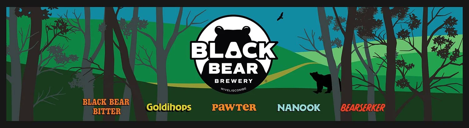
In a loosely comic style, rolling hills and woods have been created as backdrops for the brand identity across items such as banners, bar runners, and print materials.
Colours & Fonts
Colours
Basic black-and-white for the logos. New comic book-style colours dominate the background graphics.
Fonts
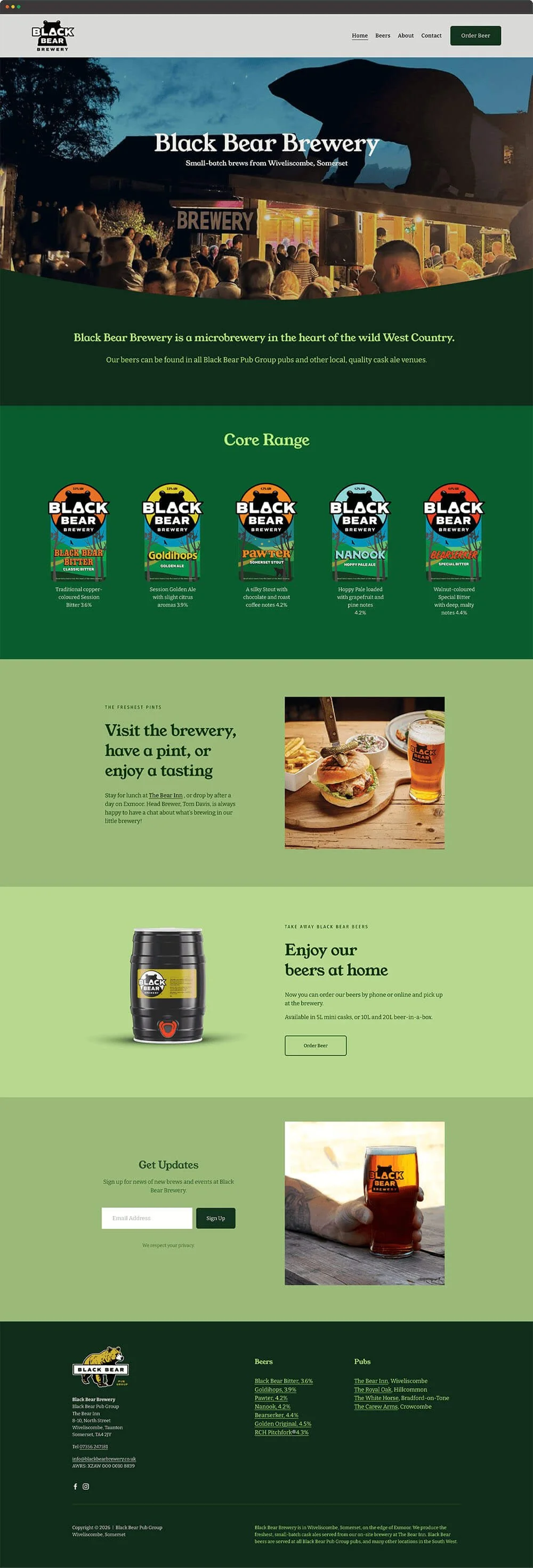
Recoleta, a warm and friendly, 70’s-style serif, is used for headers and paragraph text on all print material.
Young Serif mimics Recoleta and is used for headers, while Bitter is used as a paragraph font on the website.
Beer Branding
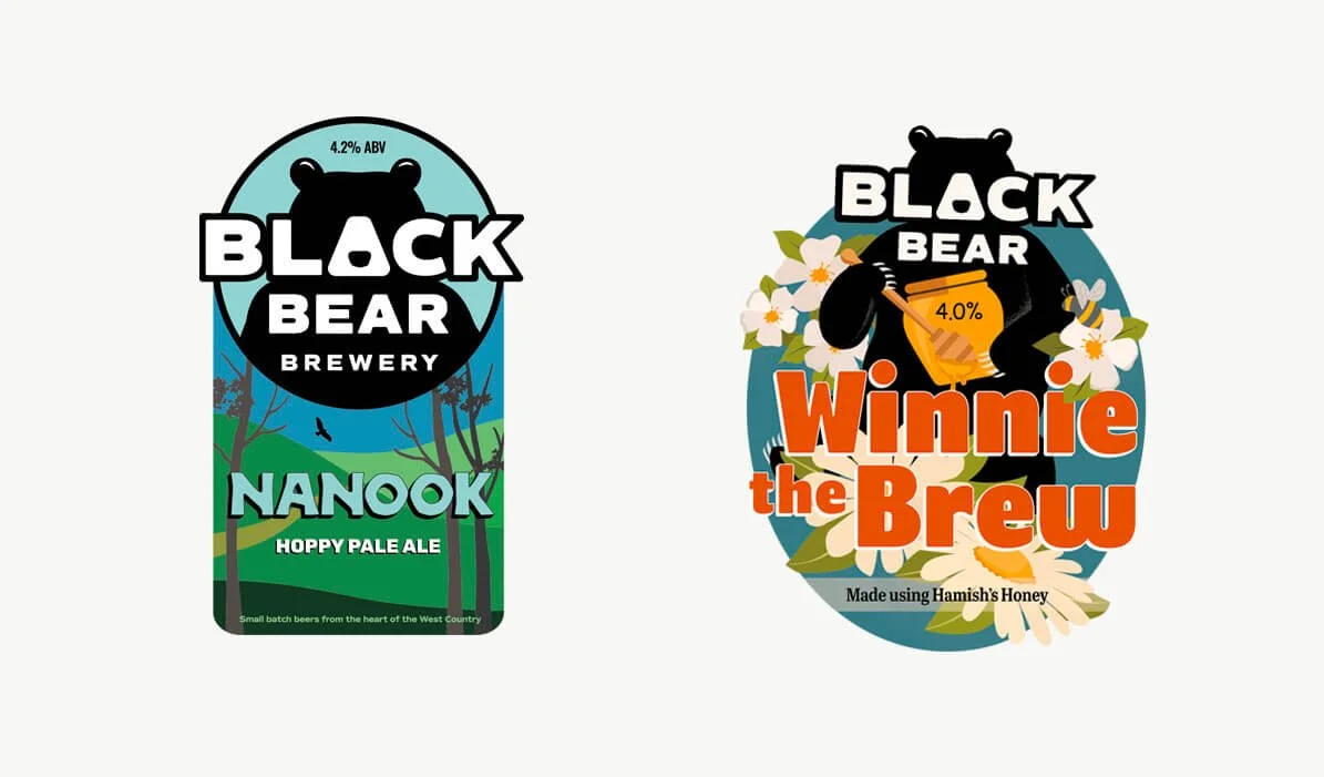
Each beer in the Core Range has its own colour and font treatment. These are used on each pump clip and will be featured on upcoming bottle labels.
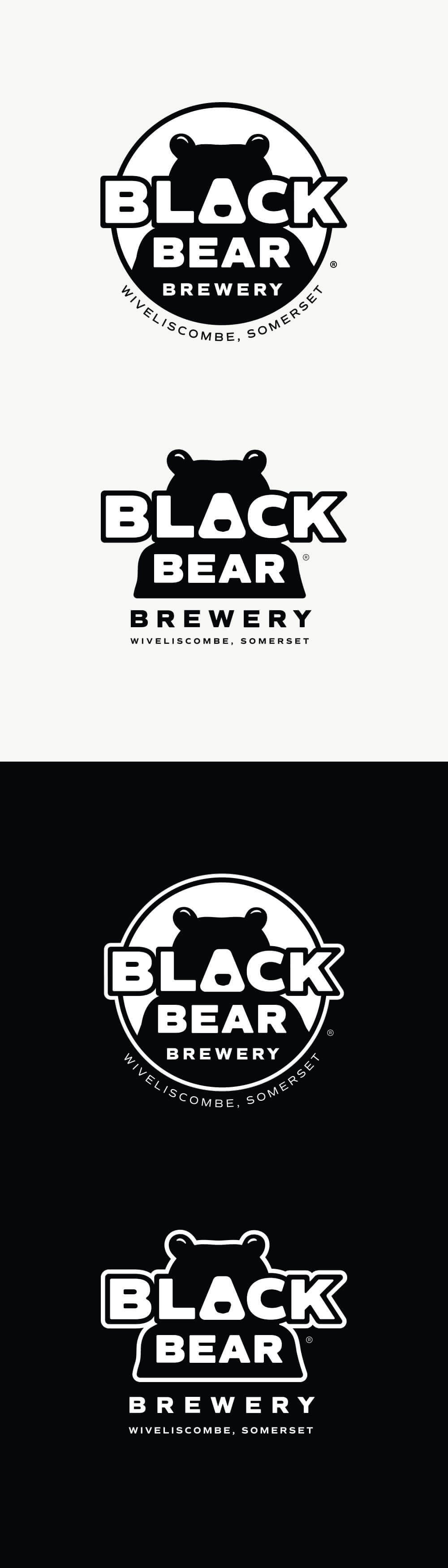
Images: Logo variations / Website homepage / Black Bear Brewery bar runner with green rolling Somerset hills graphic elements / Black Bear Brewery pump clip samples showcase the versatility of the distinct, highly stylised brand name and bear-face logos.
Brand Strategy
I developed the logo with variations. The distinctive bear face with an ‘A’ nose is maintained throughout.
Logo Variations
Headshot logo
This version is used for things like pocket placement on T-shirts. It also sits nicely in the website header. It’s also been used in anthropomorphic ways – adding a bear body to it, with the bear standing up. It looks fantastic on seasonal pump clips.
Circle logos
You’ll spot this version all over on pump clips, stickers, hats, bar runners, and hoodies.
Built for light and dark backgrounds
All versions of the logos were specially drawn for use on light or dark backgrounds.
Regional versions
We added logo versions that include the town and county names. New merch will include regional identity – small logo usage will not.
Brand Graphics
This is where the green Somerset hills that surround the town of Wiveliscombe come into play.
In a loosely comic style, rolling hills and woods have been created as backdrops for the brand identity across items such as banners, bar runners, and print materials.
Colours & Fonts
Colours
Basic black-and-white for the logos. New comic book-style colours dominate the background graphics.
Fonts
Recoleta, a warm and friendly, 70’s-style serif, is used for headers and paragraph text on all print material.
Young Serif mimics Recoleta and is used for headers, while Bitter is used as a paragraph font on the website.
Images: Logo variations / Black Bear Brewery pump clip samples showcase the versatility of the distinct, highly stylised brand name and bear-face logos / Black Bear Brewery bar runner with green rolling Somerset hills graphic elements / Website homepage.